I’ve noticed, of late, the incorporation of books into, let’s call it, ‘space-styling’. Shop window displays – whether selling perfume or interiors will use the carefully placed spines of novels stacked on top of each other as a sort of palette to illustrate their wares. They are stacked vertically or in the more traditional horizontal row. Books are being used to sell other products like a model typically would. And the appeal is obvious. Books come in many different sizes, of varying thickness and texture, and an array of colours. They can collectively add form and stylistically can convey a feeling, a sense of place, smell even. I’m an avid reader and enjoy books for the world building, story-telling, and social commentary that can be found between their pages but I also love the look of my bookshelves piled with them in all directions – the varying dimensions, some tall and solid, some small and bendy. Quickly running out of space, threatening to fall and hastily being reassembled until a new one comes along and space needs to somehow be found to accommodate it. My walls would be naked and look rather sad without the many books stacked against them.
Although I always tend to gravitate towards a particular style and aesthetic, my mood on a given day can also determine what I want to read, and book cover design is a large part of this too. My bibliophilic tendencies do not yet include the owning of the same book in many different editions with varying cover art; but I know that day soon will come. Especially given the type of reader that I am. I enjoy taking my time over a book; reading it over a drawn out period. I just like to have a particular book that I’m reading at a given time, and I like that same book to occupy space in my bag for a while. This coupled with the fact that my tastes are admittedly narrow and not at all that broad when it comes to genre; most definitely means that in order to keep up with my impulsive obsession with buying a new book, titles will have to start repeating themselves.
My preferred genres are Classics, Dystopian, Modern Classic (Black Authored), Darkly Comedic/Satirical.
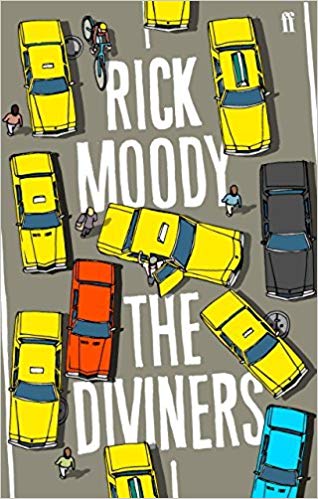
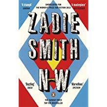
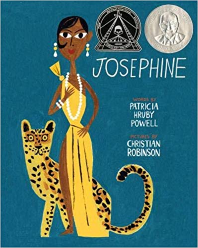
Although that all seems rather heavy, I do love a nicely designed cover – some examples of what has caught my eye:
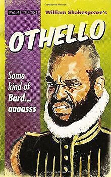
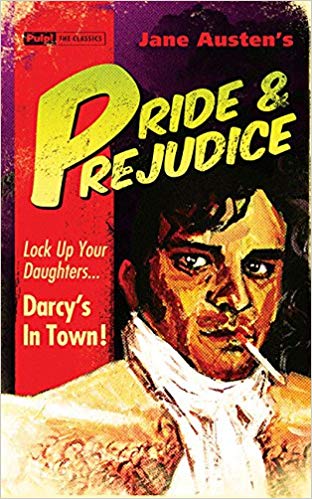
Pulp! the Classics have modern entertainers moonlighting as classic heros/antiheros on their covers along with tag lines that really sell the concept.


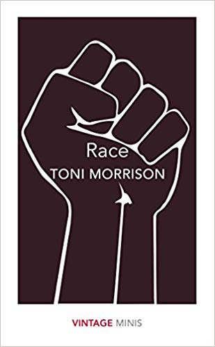
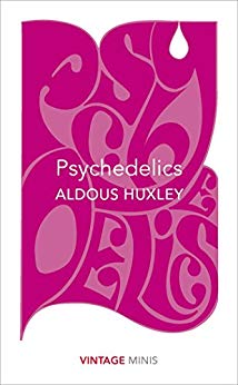
Vintage Minis utilise a smooth, clean, colour-block style palette to illustrate the neatness of excerpts taken from the tomes of great classic and modern authors communicating their ideas, philosophies, and social autopsies.


I’ve picked some cover examples of the following from books included on my digital book shelf
Sketch-style illustration I find these particularly fun and creative editions to any collection of books.

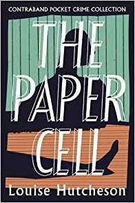
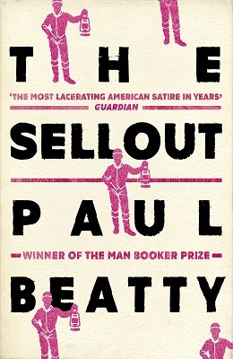
Typeface A striking typeface can be a big draw on the edition of the book that I choose to purchase. If its done in an interesting or quirky way, and the bolder the better then I am sold.

Photographic Whereby the appreciation of a well taken photo is what reels me in particularly when looking for a cook book, reference book, or travel guide.

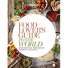
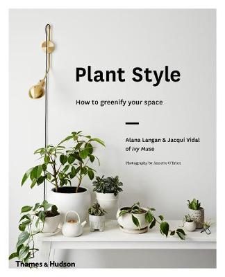
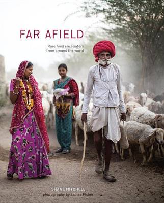
The latter category of books are the type that I open while reclined in my POÄNG Armchair or in the mini-reading nook beside my terrace window. Funnily, I am at my most suggestible to colour saturation, the pull of far away places, and deceptively easy-looking recipes when I’m lounging very comfortably at home.